
Understanding Visual Hierarchy in Web Design
Article by Beatrice Aranton and J.C. Yee
Graphics Design by Kirsten Tumbokon
A study made back in 1912 in Germany called the Gestalt Psychology explained that humans do not perceive information in an equal and linear way. When users read through the contents of a page, they don’t skim from top to bottom. Instead, they pick out the content they deem important based on how they are presented or emphasized in terms of design.
Several decades later, the study paved the way to how marketers and designers help users process the most important information in a website, or any digital interface for that matter, through Visual Hierarchy.
What is Visual Hierarchy?
Visual hierarchy helps portray the importance of elements in a particular composition by placing them according to their priority. In visual design, it’s the key principle that guides the eye to information in a specific order for a specific purpose. It is also what makes your market read through an entire message on the web. By establishing a strong visual hierarchy on a website, you can guide viewers into the bigger picture to automatically have them process their parts.
How Visual Hierarchy Helps Your Brand’s Marketing Efforts
Visual hierarchy holds importance in marketing schemes as this affects how consumers perceive information, how it impacts their memory, and how it drives their buying decisions.
When it comes down to it, it’s all about presentation. How you present your visuals can either make or break the results of your design. For good content to be interpreted properly by your target audience, the way you convey your message must be equally appealing.
It’s important to catch the eye of your market because you pique a consumer’s interest in what you’re trying to sell. This increases your chances of getting them to convert.
In this article, we discuss the 5 basic visual elements that help users gauge the most important cues on a page and how each element is related to a more specific interface design principle.
5 Basic Elements of Visual Hierarchy
1. Size
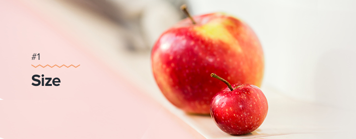
The most attention-grabbing or most interesting area in your design can be determined by its size, whether in graphics or text form. In web design, the size of any page content signifies the weight of its importance on a page. When designing headers or sub-headers; editing text in slightly bigger font sizes than the rest of the contents on the page helps users in finding out what they’re reading about and extract the idea from those highlighted words. Size is what initially helps your audience know which parts need to be paid attention to. It falls under Fitts’s Law, which basically implies that bigger elements are more important for the user.
2. Proximity and Spacing
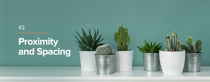
Proximity and spacing in design clear the difference between two varying objects by putting them side by side. This also effectively conveys the distance between the two objects and a determining factor that tells which of the two is more focused.
The picture above shows two groups of plants that have been separated by a space. In a way, proximity and spacing not only fall under the Law of Proximity but also under the Law of Common Region. Whereas the Law of Proximity states that objects near to each other tend to be grouped together, the Law of Common Region states that elements are perceived into groups if they share an area with clear boundaries.
3. Contrast
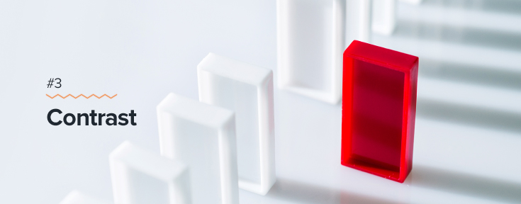
Contrast is what makes the designs pop as it emphasizes the difference between lightness and darkness, or thickness and thinness of contents. Contrast can be made up of colors, shapes, direction, size, and texture. This is a matter of discovering which shades in the color palette compliment each other well. It is one of the easiest ways to create visual importance and tell people what to look at on a page.
The Von Restorff Effect is the perfect maxim that applies to Contrast since it states that people tend to remember an object that is different from the rest.
4. Rule of Thirds
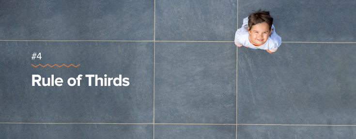
This is a technique where a design is divided into three rows and three columns, placing a subject at the points where lines meet.
Designs with subjects that are centrally composed make strong points, but this composition may be overused after a while. Should that be the case, a professional web designer can help you provide the best technique on how to make your designs pop.
You’ll also find that putting your subject slightly off-center may help your design look more interesting. This lets the reader’s eyesight naturally go to the point of focus instead of putting the subject in the middle.
That said, the Rule of Thirds somehow leverage the Serial Position Effect, which also infers that items on the right or left are more likely to be memorized and that items on the middle are perceived to be the least important.
5. Alignment, Balance, and Scaling

Symmetry is something that our eyes are naturally drawn to. It brings familiarity, compared to the effect of asymmetrical patterns and designs that we perceive.
Alignment assumes the balance in a picture. Artistic touches in the design are often seen as a disarray of elements, but aligned objects and texts are more likely to gather attention and draw the eye automatically to it. Harmony or balance among the elements incorporated in design brings balance and could look aesthetically pleasing to the eye.
Combine these three together, and what you get is a principle that thrives on the Law of Uniform Connectedness, wherein visually connected elements are perceived to be related than those that are not.
Create Remarkable Web Design with Gotafflair
Humans are naturally visual beings. We process information better and faster through visual cues. In marketing, the first step to successfully market a brand should be focused on conceptualizing designs that effectively visually communicate with your audience. Any marketing message you convey should be properly organized and prioritized according to their relevance so that anyone who stumbles upon your website would know what you’re trying to get across.
Gotafflair’s band of design experts offers creative solutions that can effectively give your website an edge that goes beyond appearances.
Call us now at 798 8195 or contact us at sales@gotafflair.com for a free consultation!