
5 Reasons Why You Should Consider a Minimalist Web Design
Article by Cyd Cruz
Graphics Design by Ryan Rivera
For a generation that possesses a variety of editing software to create flashy, loud, and eye-catching graphics, modern web designers seem to prefer taking a minimalist approach when it comes to layouts. As we can clearly see on most websites and advertisements nowadays, the “less is more” method of designing promotions seems to be the most commonly-practiced one.
While it’s easy to dismiss it as just another passing trend, minimalist web design has been proven effective from an online marketing standpoint. Here are the reasons why a minimalistic approach to web design is an advantageous one.
Why Minimalism is an Ideal Web Design Approach
1. It’s a breath of fresh air

In an era where internet marketing mostly involves different websites trying to outdo each other in terms of design, a minimalistic approach to your site layout may appear as a welcome change.
Providing a simple homepage with a basic banner, visible welcome text, and functioning navigational buttons will create an inviting atmosphere as soon a user visits. After all, a surefire way to have a potential customer buy your product or service is to make sure that your website is tolerable and easy to navigate.
2. It allows pages to load faster
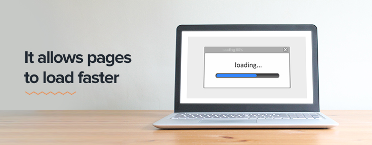
Not only do minimalistic pages put a user’s mind at ease, the lack of intricate and flashy visuals will also allow the page to load faster.
During this day and age, quick loading speeds are a must and a study supports this, stating that 47% of consumers expect a page to load in less than two seconds, with 40% of the same group abandoning a site that takes more than three seconds. Consequently, a slow-loading site will result in users clicking out of it immediately, resulting in a significant increase in bounce rate.
Bounce rate, to give a short definition, is the percentage of users who immediately exit your site from the same page they came in from. This percentage is used as a measure of page quality and a high bounce rate signifies your content’s lack of relevance to your visitors’ interests.
3. It has a more user-friendly vibe

An average user is used to having products shoved in their faces. Pop-ups that show an immense amount of exclamation points, splashes of bright colors, and moving visuals indicating a sale or a discount is already a pain in the rear at this point. Closing off these unwanted and intruding ads, websites, and service offers have become second nature to them, so why should yours be any different?
Minimalist designs give off a more user-friendly vibe, showing them that you’d rather present what you have to offer instead of bombarding their screens with never-ending gimmicks.
4. It allows for easier page scanning

When searching for something specific, page visitors tend to scan articles, pages, and other forms of content instead of reading through the entire webpage. That’s right, that means that bittersweet backstory you added on your article will more than likely be ignored and scrolled through as they search for what they actually need.
That’s where simple web design comes in. The less content to scroll through, the less time wasted through the eyes of a page visitor. It’s a lot more ideal to condense your site’s product or service, its purpose, and what it can do to benefit the user than provide tons of information that won’t add any substance to anything.
5. It’s more effective on mobile devices

Due to the rapid increase in mobile usage in the past few years, it would make sense for web designers and developers to optimize their webpages for phones. In fact, roughly 52% of online traffic has been recorded to come from mobile phones.
That being said, minimalistic website designs tend to not clutter up a user’s screen with unnecessary colors, offers, and other intrusive content. This is true especially for page visitors on mobile, where the screen is noticeably smaller.
Get your website evaluated and improved with Gotafflair!
Here at Gotafflair, our web designers and developers possess the skills and experience to assist businesses in boosting their online presence. Let us help out with your internet traction while you sit back and relax.
Looking to refurbish or build your own website? We’ve got you! Contact us at 7798 8195 or link up with us via email at sales@gotafflair.com for a free consultation!