
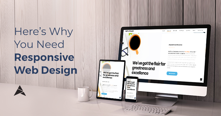
Here’s Why You Need Responsive Web Design
Article by Beatrice Aranton
Graphics Design by Kirsten Tumbokon
The growing importance of businesses’ online presence has resulted in web design as a critical factor in the business-building process. Companies vastly use the internet nowadays as a window to widen their reach to their customers. And with the growing number of digital users with different devices comes the need to adapt their content displayed on each device. Designing multiple versions of the same site to attend to each size of screen and resolution surfaces impractical costs and takes high maintenance effort, leading developers to look to simpler solutions.
This has caused the emergence of an approach that lets users seamlessly view a website on any device: responsive web design.
What is Responsive Web Design?
Responsive web design is an approach that allows designers to build a web page that dynamically adapts accordingly to the sizes of various devices.
Nowadays, websites need to look great and work well on a desktop, a tablet, and a smartphone’s browser. With responsive web design, you get to have just one site with different elements that respond differently when viewed on various devices. This approach eventually results in good user experience as it enables websites to operate in a fast and optimized way regardless of whatever device a person uses.
Elements of Responsive Web Design
The following are the elements that Google requires for a website to have an effective responsive web design:
Readability

Reading on a mobile device shouldn’t require you to squint or zoom in on the words just to be able to see properly. The text must adjust accordingly to the size of the wide screens, allowing you to read with comfort. But in this case, smartphones have much smaller screens, therefore text should be legible, without the need for zooming, and should fir the device’s screen perfectly.
Seamless Scrolling

You are at a disadvantage if viewing a website on your mobile feels just like reading out of a shrunken version of a webpage.
A responsive design shouldn’t have to let you scroll sideways and downwards just to be able to read the content; it should be a seamless experience for your visitors.
Optimized Page Buttons

Some buttons that are easy to click with a mouse may not be as easy clickable with mobile phones. A responsive design attends to the need for these buttons and links to be optimized for mobile viewing.
Reasonable Page Loading Time

Responsive websites tend to load faster on all devices, especially on smartphones and tablets. Ensuring a reasonable page loading speed requires fluid grids and images which size and quality are optimized for the web.
7 Reasons Why You Need a Mobile Responsive Website
1. Easier Social Sharing

Mobile convenience has become essential for citizens as well as business owners. Making your website mobile-friendly gives them the idea that your website is accessible anywhere and anytime, at the click of a button on their phones. This is a first step in gaining your potential customer’s trust. And when all content and pages are flexible across all screen resolutions and devices, this makes social sharing easier, allowing you to grow a bigger audience, or attain a wider reach for your brand.
2. Lower Bounce Rates
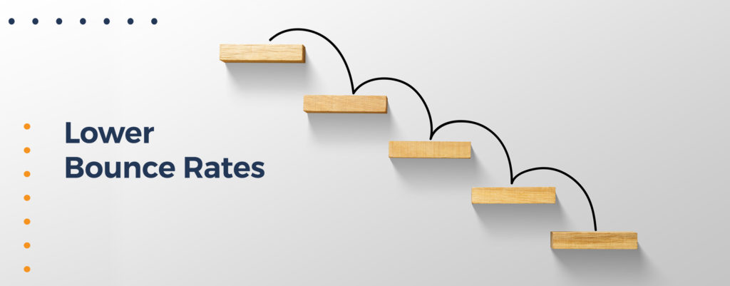
Providing optimal experiences for your users gets them to stick around longer and explore more areas of your website. There are lots of ways to keep them engaged, but on matter how good your content is, it’s still pointless if elements of a responsive website are ignored. Giving users the convenience when browsing through your site means that they’re less likely to bounce.
3. Higher Conversion Rates

Creating a consistent experience that increases lead generation, sales, and conversions is another plus in switching to responsive designs. High conversion rates can go alongside a website’s low bounce rates; if people stick around longer in a website, the higher the chances are of them feeling more inclined to avail of your products or services. Your website’s high responsiveness is the appeal it needs to get potential customers to stay. Engagement follows this step, and then you can just wait for a conversion to naturally occur.
4. Lower Maintenance Needs

Having separate desktop and mobile sites to maintain can be a hassle. The beauty of using responsive web design is that it allows you to maintain only one website and no further need for maintaining a separate mobile site. Its one-size-fits-all approach helps you spend less time on site maintenance, so you can focus more on content creation.
5. Faster Web Pages

Mobile users tend to abandon webpages that take longer than three seconds to finish loading. Websites that are not optimized for smartphones and tablets are hard to navigate and may frustrate your visitors. There are modern performance techniques like caching and responsive image display which helps improve your page load faster, ensuring that your site is as responsive as it can be for your visitors.
6. Improved SEO

Since responsive web design betters bounce rates, this will reflect positively on how Google will evaluate your website and rank your website higher on search engines.
SEO Campaigns and website maintenance will be much easier for you and will be a much smoother process if you have a mobile-friendly website. In fact, the development of e-commerce solutions now makes use of this flexible approach to improve SEO efforts, and to ensure your business’ success online.
7. Easier Analytics Reporting

Google has much recently added to its algorithms the mobile-friendliness of a website. Since there has been a significant increase in the number of people who use their smartphones rather than desktops, the need to track viewership is now important. Creating applications for easy mobile access makes this harder to do since you need to track two separate platforms. But if your website is equipped with a responsive design, then analytics, tracking, and reporting can all be in one place.
More and more people make use of their mobile phones nowadays, and the rise in mobile devices is only the beginning of a shift to more convenient web usage. It’s necessary to make sure your website can be viewed anywhere by your users on any device by tapping web professional who can help your website reach its peak functionality.
With Gotafflair’s team of trained web developers, we can help you build responsive web design, and ensure that your business makes the most out of its online presence.
Get a free consultation today by sending us an email at nicole@gotafflair.com or calling us at 798 8195!